Italian Promo Stuff? Fahgettaboutit...
 Hey guys, it's Donnie...Italy seems to get all the good shit. They've got the best pasta, Vespas, they had Michael Corleone for a while, and now they've got some really nice promo material. Then again, they also have to navigate around the Pope's private city/country which is inconveniently situated right in the mid-calf region of the country, so I guess we'll cut them a break.
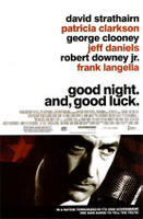
A few days ago we got a hold of the domestic one-sheet for George Clooney's next directorial effort, the very promising Goodnight and Good Luck.

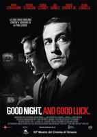
Eh. The poster's not horrible. I like the red star and the classic microphone, but they've got two-thirds of essentially empty space there. Meanwhile, the Italian poster...

SO MUCH NICER. Just plain classy. The profile of Clooney is nice because he's somewhat prominent without drawing alot of attention to him, since he's not the main character. I also really like the little TVs in the background. Subtle, yet effective.
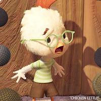
 Then this morning I discovered the Italian teaser for Chicken Little. I LOVED the first teaser with all the reporters and the toilet paper roll, and I also loved the one that spoofed the Hitchhiker's Guide trailer, mostly because I was sitting in Hitchhiker's Guide when I first saw it, so I pretty much lost my shit. However, I think we can all conclude that the "dancing Chicken Little" clips have been exceedingly lame. Click it here to see what I'm talking about. It's like they've got two-thirds of a trailer for a pretty decent movie and then they ran out of rendered video so they just slapped on some dancing chicken nonsense they made while they were screwing around at the office one day.
Meanwhile, click it here to check out the Italian teaser. See, for some reason this one is actually funny. The video is exacly the same, so what could it be....? Oh, I know! The music isn't totally fucking boring. I'm not saying that this Italian tune is "my jam" or anything, and yes, perhaps I'm subconsciously just laughing at the silly Europeans, but it still works better than the schlock Disney's spoon-feeding us ugly Americans.
Between these little tidbits and the Batman DVD Artwork I found last week, I think it's time we get some European design folks to cross the pond and start giving our shit a little style....
0 Comments:
Post a Comment
<< Home