Spiderman Is Black
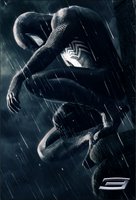
 Hey guys, it's Donnie...So by now this picture has disseminated all over the internet and Max Fischer was kind enough to point it out on Friday, but I feel like I should weigh in on our first real bona fide look at Spider-Man in his third go around. To the right is the image that Sony released last week, along with the disclaimer that it is NOT a black and white picture but is, in fact, Spidey in his infamous black suit. This is the closest we've come to an actual confirmation from Sony that Topher Grace will actually be playing Venom, the symbiote creature who breifly inhabited Peter Parker's black suit until Parker rejected him and went back to the good old red and blues.
First off...yes, that picture is badass. There's really no getting around that. Sony claims that it is not actually the teaser poster and is merely a promotional image, but, honestly, they could start plastering this up in theaters tomorrow and it would be a pretty great way to introduce the film. The tone, the shot composition, the emotion in this one image is incredibly powerful.
Now, about that suit...I have to agree wit most fans/critics that if what we're seeing here is really the final version of the black suit, I think that Raimi and company have really missed a huge opportunity here. Rather than stick with the traditional comic version of the black suit, they seem to have merely taken the red and blue suit and made it black and white. I guess I can understand the various thematic and practical (CG effects) reasons why they'd do that, but I still say that they could have stuck with the classic design and it would have been just peachy.
 To the left is a fanmade photoshoped version in which the suit is a pretty damn impressive reflection of the comic suit, most notably the lack of raised webbing, the large chest logo and the white eyes.
But who knows...perhaps there are good reasons that have yet to be contemplated. Maybe they're reserving that design solely for Venom. Maybe this is still a work in progress. Who knows. They're still fairly early on in production and Sony is being more than a little tight-lipped about releasing any info on the film. I say it's too early to pass final judgements. Besides, it still looks worlds better than the crappy Rent-esque X3 posters...
0 Comments:
Post a Comment
<< Home